
Hey Bubble community -
I’ve pointed to Erik Kennedy’s design blog before as a solid resource for learning design. And wanted to share his most recent newsletter on responsive design patterns. (Pasted below; no direct link to read in browser).
These tips are pretty helpful for thinking through flexible designs in free-form environments (like Bubble) and understanding the why behind things like fixed width, max width, min width, etc.
Today we’re going to talk about one of the most confusing aspects of layout: responsive design .
With the advent of the miniature web browsers that we all carry around in our pockets – I’m talking about our phones , if you’re a little slow today – the whole issue of laying out a design got a LOT more complex.
What used to be a single static image, exported from Photoshop and sent to the devs is now… two? three? four? How many images do we need, exactly? Or maybe our designs should be more fluid than a bunch of static images? Uhhh, does anyone know any prototyping tools!?
( SHOULD DESIGNERS CODE!?! )
We put our best people on the problem, and they decided the answer to the completely amorphous and fluid size of modern viewports was to re-use the solution favored by poster designers a century ago… grids! You’ve heard me complain about grids (and tell you what to do instead). No need to re-hash it all here.
Instead of finagling "responsive grids”, I’m going to give you two steps:
- Get to know a couple responsive container patterns …
- And then listen to what your content wants .
Sound good? Let’s get started. Here’s the four most useful responsive design patterns I know . Are they technically all you need, ever? Definitely not. But they’re an highly useful start. Taken together, they create a framework for viewing responsive web behavior that, once you see it, you just can’t un-see .
1/ Fixed-Width Containers
This is the simplest “responsive” pattern in that it doesn’t actually change (AKA respond) to screen size changes . There are some elements, that, at least while everything around them is shifting in size, stay completely the same .
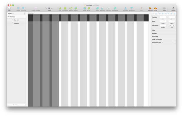
Check out the sidebar in the Learn UI Design course app:

Notice what it does as the screen changes size?
Hint : oh yeah, NOTHING AT ALL.
(OK, fine , at a small enough screen size, it will completely disappear into a menu item. But as long as the layout has enough room for a sidebar , that sucker is basically one size)
Now here’s a question: why ?
The answer is: because that’s what the content wants . Turns out a sidebar looks reaaaally weird if you make it expand with everything else (AKA a percentage-based layout, which frameworks like Bootstrap are pushing on the uninformed masses).

No bueno , my friends.
This has thrown off many of my students too. The Design Internet says grids are important. Really important. Get one set up even before you begin designing , they say. But if there’s a sidebar, what do you do?
Play nice, and align your sidebar to the grid?
But what happens if our screen width – and therefore our grid size – grows !? We’ve seen where this goes…
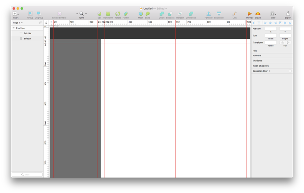
Feel free to use the grids if they help you keep things aligned, but for the most part, your layout will work fine with just a few rulers to delineate 3 things :
- Section boundaries
- Section padding (in the image below, set to 20px inside of each section)
- Any centerlines that’ll be useful
Like this:
So that’s it. The simplest responsive container will… do nothing at all. Or, at most, it will completely disappear on the smallest screens.
The Fixed-Width Pattern:
- At small widths : pick some specific width (or relegate the element to a separate view)
- At medium widths : use the same width
- At large widths : same width again
I think you’re ready for something more complex now
2/ Infinite-Width Containers
Infinite-width containers are those that expand with the screen width, no matter how big that is.
You typically see it with splash images :

Or top navigation areas , or when the screen is sectioned into parts :
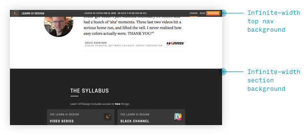
I call it the infinite-width pattern to stress that even as your screen size expands to infinity, so will these elements . Will your images get blurry? Sure. Will some items perhaps be positioned hundreds or a thousand pixels from anything else? Perhaps . Hold that thought until we learn the next pattern.
By the way, why do we have the infinite-width pattern? Say it with me: because it’s what the content wants .
Some things (particularly things that section off the screen) just demand to be full-width, no matter what , because if they weren’t, it would look awkward.
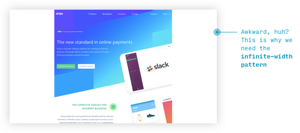
Here I’ve messed with the dev tools to change Stripe’s homepage to have a max width. Anything that qualifies as “background” now looks reaaaaaally weird.
The Infinite-Width Pattern
- At small widths : the element is 100% of screen
- At medium widths : still 100% of screen width
- At large widths : stiiiill 100% of screen width
Interestingly enough, the infinite-width pattern is not the most common, nor most powerful responsive container pattern. But it becomes extremely powerful when paired with the third pattern.
3/ The Max-Width Containers
The dirty secret of most good responsive design you see is maximum widths . Please, design community, apply as much evangelizing to max-width containers as you currently do to grids, and we’ll be OK.
It’s the most frequent pattern I’ve used in specifying responsive behavior for my designs. And you see it all the time .
Here’s Stripe again, because… why not ?

Or, for those of you with gigantic monitors, you’ve probably opened up facebook and the max-width pattern is clear as day .
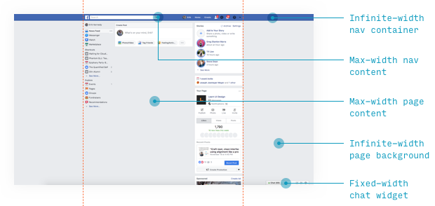
(Yeah, I use an adblocker to hide my newsfeed. Believe me, just because I happen to know you in person doesn’t mean I want to know your opinion . Isn’t that what mailing lists are for? Thank for you attending my TED talk.)
OK, I went overboard annotating the above image. I found an example of every pattern we’ve talked about!
But this is what it’s all about… the interplay between all the patterns. Knowing someone will be viewing your design on a gazillion pixel monitor, and someone else will view it on a watch , you’ve got your work cut out for you.
Fortunately, copious use of max-width containers nested in infinite-width containers should do ya pretty good.
Oh, and one other lesson from the max-width container bit. It may be obvious, but content DOESN’T have to take up the full layout ! Set the max width to whatever makes sense for those elements .

Impressive pattern, Stripe.
Your content can take exactly as much room as you need it to. Just because you have 12 Bootstrap columns to work with doesn’t mean you need something to fill all of them. In letting content assume its natural width , you actually draw attention to it.
Remember the first time you saw this? (or however it looked back in the day?)
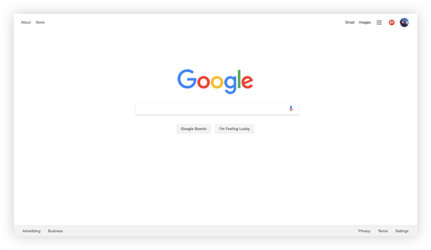
Don’t tell me how old I am.
Also, look. Even with a static image of Google.com, you can start to see the responsive patterns that go into making it up.
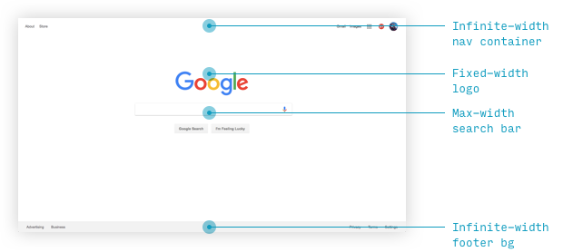
Oftentimes, interactive content will be in a max-width container nested in an infinite-width container . Here, Google’s links in the four corners will stay there even as the screen size stretches to infinity, because they’re just sidenotes – not the main point of the page.
Another note: Google’s page starts to look weird at medium widths, and for mobile, there’s an entirely separate version of the site. That being said, if you use these responsive container patterns, you’ll see less and less need to ever serve a separate mobile site.
The Max-Width Pattern
- At small widths : element takes (probably) the full screen width
- At medium widths : now it’s a fixed width
- At large widths : now it’s the fixed width, again
Remember, margin: 0 auto is your friend. You’re welcome.
That’s not all the container patterns there are, but those are the most important ones. If you’ve liked this breakdown, check out Learn UI Design, because that’s where the main course is, as usual.
4/ Breakpoints determined by content
The ultimate responsive hack is to make breakpoints determined by your content, rather than arbitrary device sizes.
(A breakpoint is the width at which your layout radically changes , rather than incrementally shifts)
I know, I know. Everyone design system already has their breakpoints set to old iPhone screen sizes. It’s an uphill battle, but the ideal is for you, in the wise words of Stephen Hay, is to “ [s]tart with the small screen first, then expand until it looks like shit. Time for a breakpoint! ”
This is what Stripe does with its navigation menu:
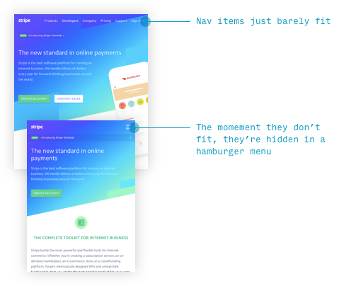
Does this mean the dev has to juggle multiplying media queries? Unfortunately, yes. So I understand the resistance. But whenever someone asks you, “ Hey, where should we put the breakpoints? ”
The answer is “ Where the content wants , dummy ” – and then you slap them in the face.
Er…
You get the idea
 Thanks for sharing, I’m going to bookmark this.